Mobile App


A gamified anxiety regulator and education system for college students—grounded in a three-month health informatics research sprint.
Most digital anxiety tools are easy to download and easy to abandon. Lua targets the gap between evidence-based techniques and day-to-day practice: habit, clarity, and feeling like the product is actually for you.
Tech stack
Sprint overview
Sprint shape. Research-first: Figma + light React—prove flows before committing to native shipping.
- Figma — Hi-fi onboarding, breathing, check-ins; components for fast iteration from interviews.
- React prototype — State spike for skips/history—not production mobile; informed later native choice.
- TypeScript — Step enums and event shapes so test builds do not rot into string soup.
- Mobile UX — One-handed, short sessions, large targets—motion kept low for sensitivity.
- iOS patterns — Sheets, safe-area, haptics framing so the concept reads as App Store–credible.
- Interviews — Semi-structured sessions → affinity maps and concrete flow edits.
- Benchmarking — Comp scans: adopt proven calm-app patterns; avoid shame/streak dark patterns.
- Domain — Copy and pacing aligned to anxiety UX ethics—optional drills, obvious exits.
- Academic frame — Rubric-driven scope: evidence, ethics, feasibility vs prototype depth in narrative.
What Lua does
- →Bundles psychoeducation and in-the-moment regulation so users learn why a skill matters while they practice it—not only when they are already calm enough to read a long article.
- →Uses game-like progression and feedback (inspired by habit-forming products like Duolingo) to support repetition without treating anxiety like a high-score arcade game.
- →Is scoped explicitly for college-age users, where anxiety prevalence is high and digital interventions often show weak real-world adherence.
Typical DAI pattern
Download → generic library → low personalization → churn
Lua hypothesis
Structured path → practice loops → clearer “this is for me” → stronger engagement
The core problem
Anxiety among college students is not only common; it is clinically consequential and economically costly. Digital anxiety interventions (DAIs) scale cheaply—but they often fail in the wild.
Users face a crowded market of breathing timers, meditation libraries, and CBT-style worksheets. Many products assume motivation is the only bottleneck. In practice, students describe experiences that feel impersonal, one-size-fits-all, or disconnected from campus life.
That failure mode shows up as:
- Low perceived fit—“not for someone like me”
- Weak habit formation—open once, never integrate into a routine
- Shallow use—features that do not translate into skills used off-device
Design insight
Sustainable anxiety skills behave like other behavior change: they need clear sequences, repeated practice, and feedbackthat makes progress legible. If the only feedback is a generic “great job,” the loop stalls.
Lua treats gamification as a delivery mechanism, not the therapy itself: streaks, levels, and micro-rewards exist to keep users inside the skill work—not to replace clinical care or pretend anxiety is a game to beat.
Differentiation
Many competitors optimize for content volume: large libraries of exercises with weak scaffolding. The student is dumped into a catalog and left to self-direct.
Lua is oriented around a guided arc: education that explains the “why,” regulation tools for the “when,” and progression that makes the next step obvious—not a wall of thumbnails to scroll.
Contrast
Library apps: Here are fifty tools; pick one when you remember.
Lua: Here is a path—learn, practice, see progress, repeat on the days anxiety actually shows up.
The product loop
- Check in. User names state or context (test week, sleep loss, social situation) so content can feel situational.
- Learn in small doses. Psychoeducation is chunked so it fits between classes—not a PDF handout.
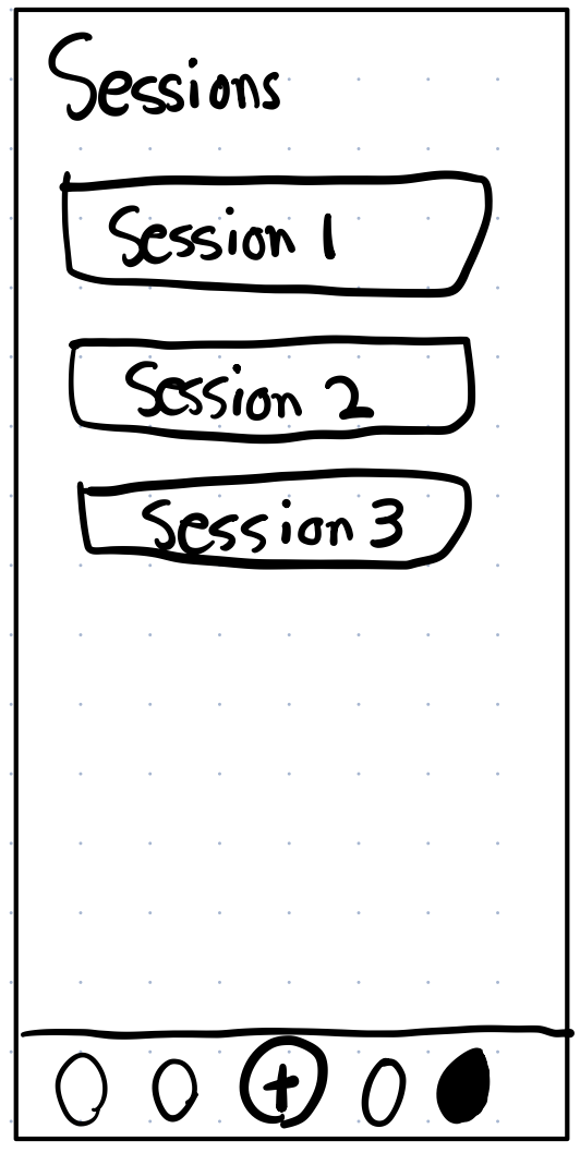
- Practice with structure. Regulation exercises are framed as levels or sessions with feedback, not one-off timers.
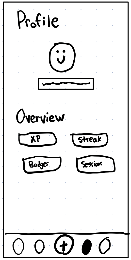
- See trajectory. Progress and streaks make adherence visible—critical when motivation dips mid-semester.
- Return when it counts. The habit is to open the app when anxiety spikes, not only when bored.
What Lua optimizes for
Not vanity engagement graphs. The wedge is perceived relevance and repeat practice—signals that digital anxiety support is working for a population that is skeptical of “wellness” spam.
Personability — Does this feel tailored to college stressors and identity, not a generic adult meditation brand?
Skill transfer — Does the user understand what to do when anxious outside the app?
Retention with integrity — Does gamification pull users through evidenced-based patterns instead of dark-pattern dopamine?
Strategic framing
Universities are a concentrated market for anxiety products—and a harsh filter for what actually gets used. If a DAI cannot win on campus, it often will not win broadly among young adults.
Lua positions itself as research-informed product design: validate pain with interviews, benchmark against leading apps, then propose an experience that closes the personalization and habit gaps those tools leave open.
Research process
The team ran twenty structured interviews with college students who had used five leading DAIs. Sessions probed efficacy, personability, and engagement—not just star ratings.
Findings were translated into experience principles before pixel work: where existing tools felt cold, where students wanted guidance versus freedom, and where gamification was requested versus feared.
Lua is a student research and design project, not a substitute for crisis care or professional treatment. Any production version would need clinical oversight, IRB-aligned study design, and crisis pathways.
User research
Artifacts from synthesis—journey and competitive notes used to align the team on where incumbents broke trust or failed to guide novices.
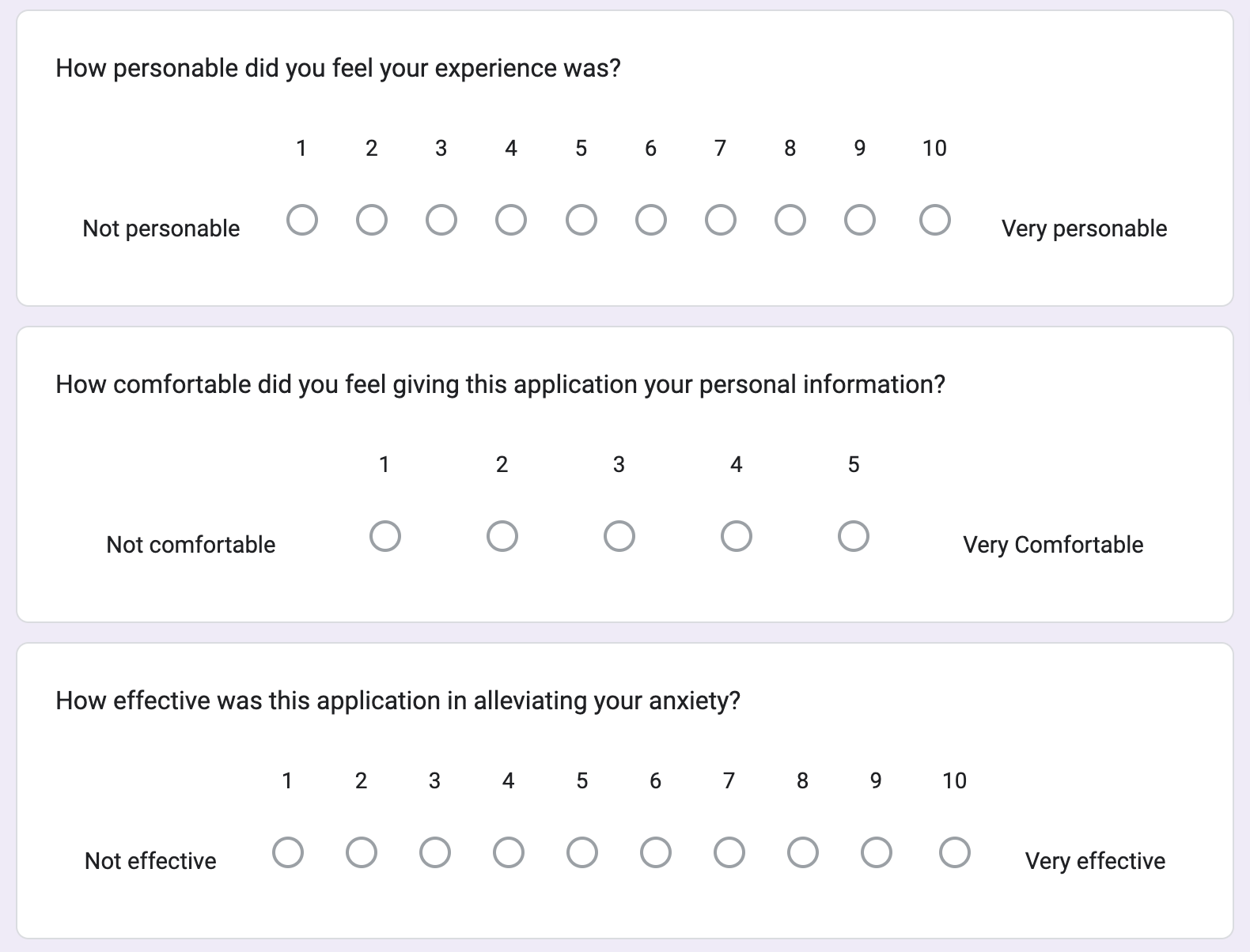
What the data emphasized
- →Personability ceiling: no product scored above 7/10 when students rated how personable the experience felt.
- →Personalization: 80% of participants named stronger personalization as the top improvement area.
- →Gamification: 60% wanted gamified features—an endorsement of habit mechanics when paired with serious content.
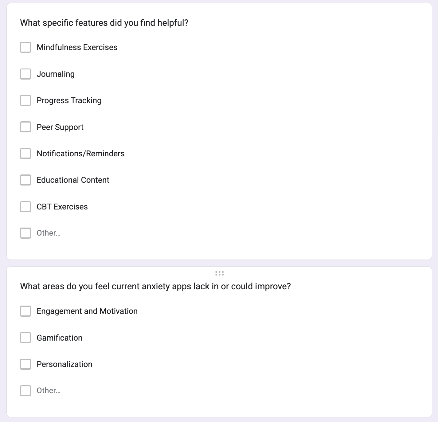
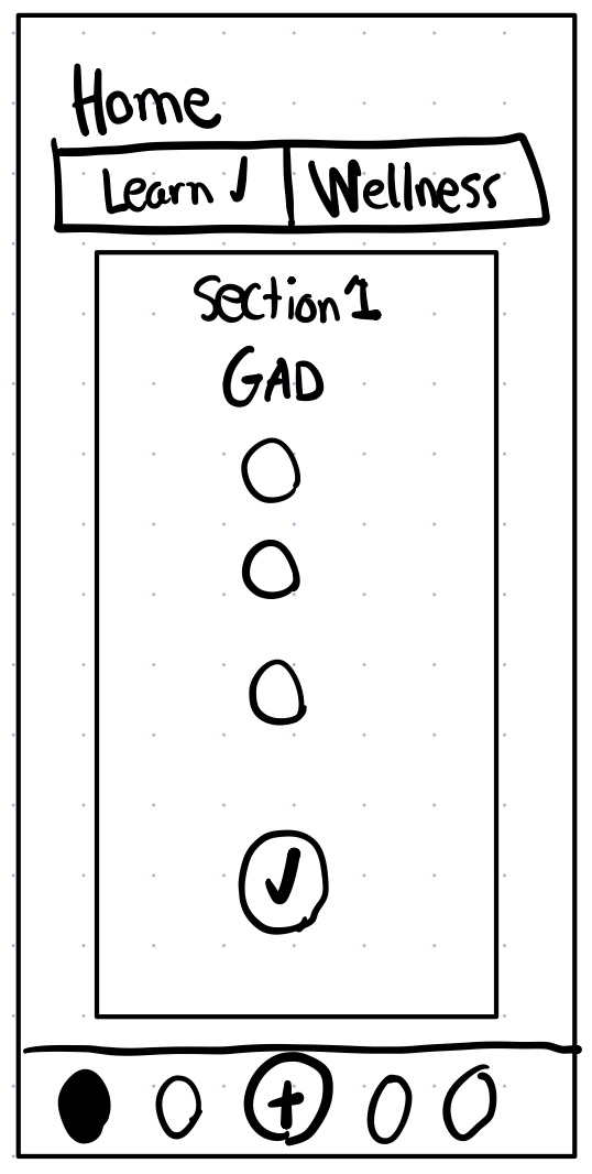
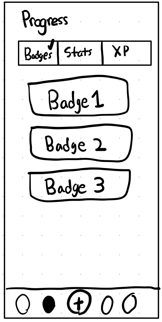
Low-fidelity exploration
Early screens tested information hierarchy: how much education to show before a practice module, and how progression should read on a small display.
Product demo
High-fidelity prototype in an iPhone frame—scroll-states, transitions, and the core loop as it would ship for user testing.